The magic of the sketch, and why it works better than pretty renders (most of the time).
Alright so, there’s always a debate about what works better to sell a project to a client.
A sketch?
Or a pretty render?
I personally think most of the time the sketch is the correct way to go, because it follows the design-process I was taught a long time ago at MIAD (well, not that long ago. 2005 isn’t really that far back.) The whole notion of design is that its problem-solving, but with an aesthetically-informed answer that can appeal to a consumer or audience better than a simple engineered-answer.
In the usual design-pipeline, there’s an “input meeting” which is a download of all the information, heartaches, challenges and background that the client has to offer. This step paints a picture for the design-team, and creates the “problem” to solve for. From here, the team begins to talk, formulates plans and momentum based off of ideas shared via mood-boards, or rough sketches or even written explanations that describe an experience.

But when you have to actually provide some sort of echo back to the client… a tangible body of work that sometimes comes in the form of a pitch for a new client, and sometimes the form of a design-solutions deck for an existing client, then you run into a crossroads with how you present your amazing new ideas. You could either jump to trying to blow them away with a super pretty render that says “this is THE ANSWER!,” or you could use a series of sketches… which say something entirely different.

A sketch has some supernatural power to it, because it is a tangible image that can translate what’s in the designer’s head, to someone else who does not live in your head. It’s an actual, concrete image of something, so it’s more than just words or discussions about possibilities… it’s a real direction or suggestions.
BUT, unlike the render, it does something super cool: it leaves the door open. Done right, a sketchy-render can improve dialogue because ultimately it says that there is an actual idea in-the-works, but it’s open to interpretation AND because it’s open to interpretation, a client feels more comfortable adding their own two-cents to the idea. A sketch says, “here’s the beginning… where we go from here is going to be a collaboration.”

That’s really powerful when you think about it. Everybody, clients included, inherently want to put their fingerprint on a design. No matter what it is. The design itself could in theory be the absolute, 100% perfect answer to the clients’ problems, and they STILL will want to toy with the concept… because they’re human. Everybody has something to say, even if it’s just to validate that they have purpose within the design process. And that’s okay. Because if someone feels they can contribute to an idea or workflow, then they have invested a bit of themselves into the project.

Get someone to invest their own “being” into something, and they’re much more likely to push for the project to move forward… with the design you and your team are developing. And that’s a good thing. A really good thing!
The looseness of a sketch is infinitely more powerful than a render… because it’s left a lot to the team’s imagination, and in complete honesty: whatever is in our imaginations, is usually the ideal “thing.” We can become much more excited by ideas in our own imagination, than a rendering can ever suggest. No matter how polished, pristine, and perfect that render is.

So this is indeed why I push for a sketch-phase as much as possible, and like to leave the renders for the end. It yields better results, because you can take people on the journey with you, and that’s how you get the team moving in one direction, and get the most input from key decision makers.
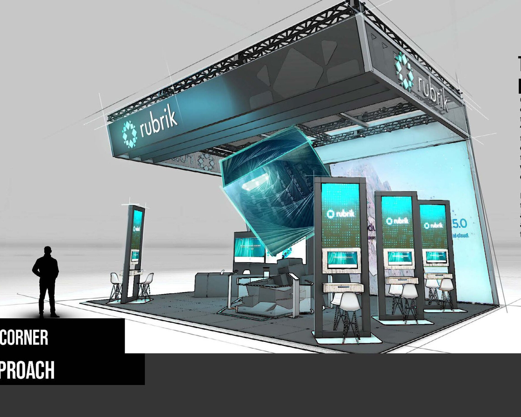
I really wish I took the time to hand-sketch more, as it’s something I loved to do, but today within the exhibit-design world, projects can move EXTREMELY fast, and so it naturally feels like an exhaustive step to try and do things “the right way.” But I’ve actually found some success in condensing parts of the workload and double-dipping on the 3D-side of things.
With not a whole ton of extra time and effort, you can move pretty quickly in 3D to sloppily kit-bash things together, shoot your shots in a viewport from Maya or Blender, and then “stylize” the shots in Photoshop to give it the sketchy look. That way you’re not eating up too much time trying to get perspectives right… which is tough and costly for some design images (especially booths and architecture). Use the 3D work you can cobble together as an underlay, and draw over it to provide that sketchy feeling. It’s always amazing to see how clients respond to the “old way” of presenting… after-all, most of the ideas that led to the world today, were drawn on napkin sketches not that long ago